Virtual Stadium offers extensive customization options to match your brand identity and user experience requirements. You can customize the visual appearance through CSS styling, replace default icons with your own branded assets, and even customize text translations.
This guide covers all available customization options for the Virtual Stadium widget.
#Table of Contents
#CSS Styling
Custom styling offers customers the flexibility to tailor the aesthetics of the Virtual Stadium widget to their precise requirements. This is accomplished by applying custom CSS properties to the widget's underlying HTML components. All customization takes place within the specified scope of the .sr-bb.sr-virtualStadium selector class, enabling customers to effectively alter the default visual presentation.
The srct-vs classes are designated styling classes for the Virtual Stadium. It's recommended to use the CSS properties listed below with these classes. While you can use other CSS properties as well, it's not advised. Using spacing properties like radius | top | padding | margin might cause issues with future updates to your setup.
#Announcement Styling
Expanded Table
| Class Name | Description |
|---|---|
srct-vs-announcement | Wrapper for an announcement banner or message. |
srct-vs-announcement-icon | Icon displayed alongside the announcement text. |
srct-vs-announcement-close-icon | Icon for closing or dismissing the announcement. |
#Bet Insights Styling
Expanded Table
#Bet Slip
Expanded Table
#Bet Slip Share
Expanded Table
#Channel Navigation
Expanded Table
#Color Styling
Expanded Table
| Class Name | Description |
|---|---|
srct-vs-color__info | Styles elements with an "info" color. |
srct-vs-color__warning | Styles elements with a "warning" color. |
srct-vs-color__error | Styles elements with an "error" color. |
#Composer
Expanded Table
#Countdown Styling
Expanded Table
| Class Name | Description |
|---|---|
srct-vs-countdown__color-info | Applies "info" styling to countdown elements. |
srct-vs-countdown__color-warning | Applies "warning" styling to countdown elements. |
srct-vs-countdown__color-error | Applies "error" styling to countdown elements. |
#Drawer Styling
Expanded Table
| Class Name | Description |
|---|---|
srct-vs-drawer | Main container for the drawer UI. |
srct-vs-drawer__button | Generic button class for actions within the drawer. |
srct-vs-drawer__open-button | Button that opens or expands the drawer. |
srct-vs-drawer__close-button | Button that closes or collapses the drawer. |
srct-vs-drawer__entry | Individual entry or item within the drawer. |
#Flash Bet Styling
Expanded Table
#General Styling
Expanded Table
#Live Data
Expanded Table
| Class Name | Description |
|---|---|
srct-vs-live-data-bg | Background or overlay used when live data is displayed. |
srct-vs-live-data-bg-overlay | Additional overlay or style on top of the live data background. |
#Message
Expanded Table
#Navigation Styling
Expanded Table
#Progress Bar Styling
Expanded Table
| Class Name | Description |
|---|---|
srct-vs-progress-bar | Container for the progress bar. |
srct-vs-progress-bar__background | Background or track behind the progress bar's fill. |
#Quote
Expanded Table
| Class Name | Description |
|---|---|
srct-vs-quote | Container for a quoted message. |
srct-vs-quote__vip | Styles a VIP-specific quote (e.g., color or icon). |
srct-vs-quote__icon | Icon placed next to the quoted content. |
srct-vs-quote__post | The post content being quoted. |
srct-vs-quote__message-header | Header area for the quoted message. |
srct-vs-quote__message | Actual text of the quoted message. |
#Reactions
Expanded Table
| Class Name | Description |
|---|---|
srct-vs-reactions | Container for reaction icons or emojis. |
srct-vs-reactions__selected-reaction | Indicates which reaction the user has selected. |
srct-vs-reactions__reaction-icon | Icon or emoji representing a specific reaction. |
srct-vs-reactions__custom-reaction | Styles a custom reaction icon or emoji. |
#Report
Expanded Table
#Tag
Expanded Table
| Class Name | Description |
|---|---|
srct-vs-channel-tag | Styles a channel tag (e.g., #channel) mention. |
srct-vs-user-tag | Styles a user tag (e.g., @username) mention. |
#User Profile
Expanded Table
| Class Name | Description |
|---|---|
srct-vs-user-profile | Main container for the user profile card or dialog. |
srct-vs-user-profile__card | Styles the user's profile card, including the avatar or stats. |
srct-vs-user-profile__stats | Container for user statistics. |
srct-vs-user-profile__stat | Individual stat (e.g., number of posts, achievements, etc.). |
srct-vs-user-profile__stat-value | Numeric or text value of a user stat. |
#Icon Customization
Icons in Virtual Stadium can be replaced with custom icons by providing branding property when integrating widget to a site. All general icons, match event icons such as goal, offside... and sport icons can be customized by inserting icon path (svg or png) as a value.
Default icons can be changed by providing branding prop to widget integration.
Svg files must have id="icon" property on <svg> element.
#Default Icons
    SIR("addWidget", ".sr-widget-1", "virtualstadium", {
        branding: {
            namespaces: {
                virtualStadium: {
                    icons: {
                        send: { // Icon ID from upper table
                            icon: "path_to_your_image_file",
                            label: "label_here" // 'alt' tag value
Expanded Table
#Sport Icons
Sport icons can be changed by providing branding prop to widget integration.
Sport Icons are used in Bet slip based on the provided sportId.

SIR('addWidget', '.sr-widget-1', 'virtualstadium', {
    branding: {
        sports: {
            icons: {
                1: 'path_to_your_image_file', // key is a ID from upper table
                2: 'path_to_your_image_file',
                default: 'path_to_your_image_file' // fallback icon for all sports
            }
        }
    },
    ...restProps
Expanded Table
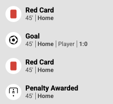
#Event Icons
Event icons can be changed by providing branding prop to widget integration.
Event icons are used when the new event is being rendered.
SIR('addWidget', '.sr-widget-1', 'virtualstadium', {
    branding: {
        events: {
            icons: {
                goal: {
                    // Icon ID from upper table
                    icon: 'path_to_your_image_file',
                    label: 'label_here'
                },
                offside: {
                    icon: